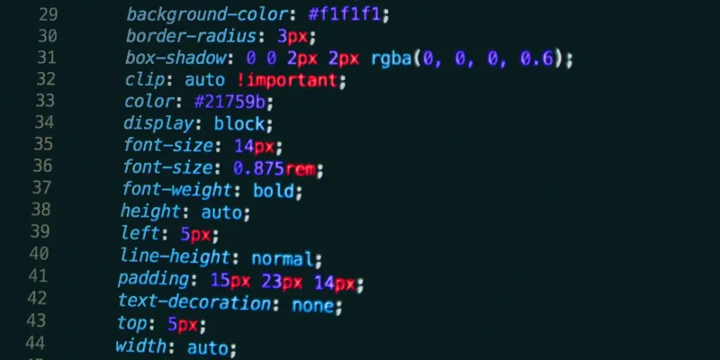
As a web developer, you have to interact with the CSS units very often. In a typical project, almost any CSS rule contains specific values that are assigned to the properties. As a result, you should know which units are available in the CSS and how they can be used.
In this article, we will describe the most widely used CSS units and types, such as integers, numbers, dimensions, percentages, etc. Please see the detailed guide in the following sections.
Absolute length units
The units given below are always the same and should be used mostly in a print or in precise documents, but usually they are not convenient in regular web sites or applications. The only exception is the px unit, which is popular because it's relative to the pixel on a screen, and also it's a common case to use it in style sheets for the regular desktop devices as well as for the mobile or tablet devices.
Following is the list of standard absolute units.
- cm - This suffix specifies the length given in centimeters. One unit equals 37.8px or 25.2/64in.
- mm - Specifies length in millimeters, and as you probably know, it's 1/10th of a 1cm.
- Q - Quarter-millimeters, which is 1/40th of a 1cm.
- in - This unit specifies inches, for example, 1 inch equals to 2.54cm, or 96px.
- pc - This suffix states that the length is given in picas which is 1/6th of an inch.
- pt - Points, one unit is 1/72th of an inch.
- px - One pixel equals to 1/96th of an inch.
Relative length units
You can also use relative units in your project, it means that the specific sizes will be relative to the size of either parent element, font size, line height or viewport area.
This method can be very useful in large projects with complicated HTML structure. For example, you can set precise size in pixels for the parent element only. Then the child elements, if they use the relative units, will use values which depend on the specific parent HTML element.
As a result, you can make style sheets that allow you to quickly change positioning of elements on the front end. That can be convenient in web development, as you need to modify only a few lines of code in your CSS files. After that, the child elements will auto-resize accordingly.
In addition, such a design can be very helpful when making responsive web sites. You can create media queries with rules only for the parent elements, such as HTML, UL, OL, FORM, etc. If you apply relative units to the nested elements, then they will be resized correctly on various mobile or tablet devices.
Please see below a list of standard relative units.
- em - If you use this suffix for the font-size property, then the unit specifies that the size should be relative to the parent element. Otherwise, it will be relative to the font size of the current element.
- rem - This suffix should be used if you want the size to be relative to the root element only. That's a popular method in web development, since it allows the use sizes which do not depend on font styles declared for intermediate elements.
- ex - The size will be relative to the x-height value of the font which is assigned to the current HTML element.
- ch - This unit specifies that the size should be relative to the width of the "0" character. The applicable font is determined by the style of the active HTML element.
- lh - The size will be relative to the line height of the current HTML element.
- vw - Unit is relative to one percent of the width of the current viewport area.
- vh - This unit is also relative to the viewport area, but it equals to one percent of the width.
- vmin - Equals to one percent of the smallest value of viewport width and viewport height.
- vmax - As opposed to the previous unit, this equals to one percent of the largest value of viewport width and viewport height.
Percentage units
You can also use the percentage units in your style sheets. This is a regular numeric value which is followed by the "%" symbol. For example, see a basic CSS code below:
.container {
    width: 30%;
}
If the "container" class is applied to the HTML element, then the browser will calculate a new value that is 30% of the width of the parent element.
As you see, the percentage units are very convenient, they can be used in fluid web design. Also, it is worth mentioning that it is possible to use them for various CSS properties, such as width, height, margin, padding and many others.
Color units
If you need to change the color of some property, then you have to use specific units as well. There are conventions that you must follow.
The generated color value can be used when configuring background for an element, changing font styles, making a shadow or assigning a border.
There are different ways of assigning a color to the specific CSS property, all the possible options are listed in the following sections.
Hexadecimal units
In most web projects, you will notice that the color is specified in hexadecimal format. The value starts with the hash symbol, which is "#". Then, it's followed by the number in RRGGBB format. Each pair represents a color in the range of 00..FF in hexadecimal format, which is equivalent to the 0..256 range in decimal format.
The RR part represents the Red color, the GG represents the Green color, and the BB part is Blue color.
As a result, you can construct a desired color value by combining specific parts together. The example is given below. There, we assign the red color in a hexadecimal format to the background property.
.status {
    background: #FF0000;
}
Decimal RGB units
The rgba() function can be used in your CSS code to define a color in a decimal format. It's a convenient method to combine red, green and blue values into a single color value.
As a result, you may not need to convert values into a hexadecimal format. Instead, you have to supply numbers directly as arguments into a function call. Please see our example below.
.status {
    background: rgb(200, 50, 50);
}
Decimal RGBA units
If you also need to set opacity for the color, then you have to call the rgba() CSS function. First, second and third parameters are the same as in the rgb() function. The fourth parameter defines the level of a transparency for the computed color. There, you need to use a numeric value in a range of 0..1.
Please see below how to make a background with an opacity level of 0.5:
.status {
    background: rgba(200, 50, 50, 0.5);
}
HSL and HSLA units
There is a different model that you can use to generate a color value for a HTML element. That's the HSL representation of a color. The H letter stands for Hue, S letter stands for Saturation and the L letter is for Lightness.
Respectively, there are hsl() and hsla() functions in the CSS that you can use to make a color. Please pay attention that the hue must be set in a range of 0..360, while both saturation and lightness values must be set as a percentages in range of 0%..100%.
Now, you can see how the green color is generated.
.status {
    background: hsl(100, 70%, 40%);
}
Also, it's possible to make a semi-transparent color, see it in the following example.
.status {
    background: hsla(100, 70%, 40%, 0.5);
}
Keywords
To quickly change a color in a CSS, you may use predefined constants. Those are the keywords that actually are aliases to the specific colors. For example, the most common values are:
black, silver, gray, white, maroon, red, purple, fuchsia, green, lime, olive, yellow, navy, blue, teal, aqua
There are more of such keywords available in the CSS. For the full list, you may consider reading the official W3C specification.
Numbers
Regular numbers can be used in CSS as well. There are specific cases when you need to provide direct numbers without any suffix.
For example, you may specify the integer value for the "order" property, like the following:
.container {
    order: 1;
}
The floating values are also accepted by the CSS language. Very often web engineers need to enable semi-transparency, then the opacity property has to be added to the code with a value in range 0..1.0.
In addition, you may need to supply pure floating values when using CSS functions, such as rgba(), hsla(), calc() and others.
However, please be careful when choosing an appropriate unit. The plain numbers may not be accepted for all properties. And in many cases you do need to use some suffix, such as px, em, or similar.
Position
If you are adding background to the HTML element then you may need to configure the position of your image inside of the container.
As a result, the background-position property has to be used with the proper values. It accepts keywords, such as center, top, bottom, left or right. In addition, it's possible to use pixel-based or percentage units to configure positioning.
Please see the example below:
.picture {
    background-position: top center;
}
Also, use can use other units if needed:
.picture {
    background-position: 25% 75%;
}
URL addresses
To use the image as a background you have to call the url() function. The correct URL address must be provided as an argument, please see our example below.
.picture {
    background: url('https://example.com/images/picture.jpg');
}
The relative URLs are also accepted, please how the code will look in such a case:
.picture {
    background: url('../picture.jpg');
}
Content property
If you are using either "before" or "after" pseudo elements in your code, then you may need to set a value for the content attribute. The most common case is adding a string value that will be rendered on a page. Example is given below.
.message::before {
    content: "Hello World";
}
There are other options available for the content attribute. For more details, see the official CSS specification.
CSS identifiers
Very likely, you've already noticed CSS identifiers in this article. They are string values that do not have surrounding quotes.
The meaning of such a value depends on the context. The typical example is a color, the valid keywords are red, blue, green, and so on. The background-position property also accepts various identifiers, such as left, right, top, bottom or center.
CSS functions
In most cases, you work with the predefined and fixed values when making style sheets. However, there may be situations when the value has to be calculated at runtime in the browser.
CSS functions are used to compute some value that is not known at the time of writing a script. Very good example is the calc() function. You can call it to make width that depends on the size of the viewport. Please see our example below.
.container {
    width: calc(100vw - 100px);
}
However, there are more functions available in the CSS. For example, max(), min(), linear-gradient() or conic-gradient() and many others.
Conclusion
As you see in this article, there is a wide range of units available in the CSS language. This gives flexibility to the developers, as they may create various applications for different needs.
For example, it's possible to create values with units that depend on viewport width, font size, line height and so on. Also, you may create different rules for each media query and use separate units for each screen size.


Comments