This article provides detailed information on how to create attractive CSS gradients for your web application. At the beginning, you will read specifications of the relevant CSS properties. Then, real world examples will be provided and you'll see what kind of effects can be done.
In most cases, it's better to use gradients instead of JPEG or PNG files, since no additional static files will be downloaded from the server and the site will load faster. As you likely know, Google considers web site performance as a major ranking factor. As a result, this will be a benefit if you use custom CSS rules for various visual effects.
Specification
To make a gradient, you need to use special CSS functions which are handled by the browser. Also, you have to provide various parameters in your code, such as direction, colors, etc. The generated gradient data should be applied to specific CSS properties. For instance, it can be used for the "background", "background-image" or even for the "list-style-image" property.
At this moment, there are three types of gradients that you can use in your CSS code:
- Linear gradient, which is represented by the linear-gradient() function.
- Radial gradient, it's represented by the linear-gradient() function respectively.
- And a conic gradient, you have to use the conic-gradient() function in this case.
We will review each option in detail later in this article, but for now, you need to see how exactly the functions may be called.
The most common method in most web applications is a linear gradient, the specification is provided below.
background: linear-gradient(direction, color1, color2, color2, ...);You have to choose the appropriate direction and then provide a list of color stops.
For the direction, you can use various units, such as:
- Degrees - you have to use the "deg" unit, for example, 30deg. The full circle is 360deg.
- Gradians - the "grad" unit must be applied to the value, for example, 50grad. The full circle is 400grad.
- Radians - the "rad" unit must be used, for example, 0.578rad. The full circle is 2Pi radians.
- Turns - you have to use the "turn" unit, for example, 1turn. The full circle in this case is 1 turn.
As for the color, you can supply any values, but they must be in the format acceptable by the CSS language. For example, #ff000, #3060f0, green, blue, etc.
Now, you can see specification of the radial-gradient() function:
background: radial-gradient(shape size at position, color1, color2, color2, ...);It's very similar to the linear gradient, but instead, you have to specify shape, size and position options in the function call. Description of all the possible values can be seen below:
shape
The default value for this option is ellipse keyword, but also it can be changed to circle.
size
The following keywords may be specified for the size option:
- closest-side - the ending shape will be connected to the side, which is closest to the gradient's center.
- farthest-side - this is similar to the "closest-side", however the ending shape will be connected to the side, which is farthest to the gradient's center.
- closest-corner - the ending shape will be connected to the corner, which is closest to the gradient's center.
- farthest-corner - the ending shape will be connected to the farthest corner of the gradient box.
It's important to note that the "farthest-corner" is a default value and it's used by the browser if no size is explicitly set in the styles.
position
This value must be compatible with the standard CSS position specification. For example, it can be "center", "bottom right", "top left", "30% 80%", or any other similar option.
Finally, you may see specification of the conic-gradient() function:
background: conic-gradient(from angle at position, color1, color2, color2, ...);In a conic gradient, the color transitions are rotated around the center. This is different from the method used in the radial gradient, where colors are actually transitioned from the center to the side.
In addition, you need to specify angle and position values, the possible values were described earlier in this article.
Now, it's time to provide live examples of the gradient functionality, please review our code samples in the following sections.
Top to bottom direction
This is one of the simplest gradients that you can add to your project. We choose the direction "to bottom", it means that the color will be smoothly transitioned from the top and to the lowest side of our container.
Please see the code sample below, the colors that we use are #3366cc and #cc3366, however you can change them to any values you wish. You may also add more colors in our own application and the gradient will look differently.
.square {
    background: linear-gradient(to bottom, #3366cc, #cc3366);
}
This is how the given code may look in a web browser:
Left to right direction
The next sample is a modification of the previous one, except the direction, the "to right" argument is passed to the linear-gradient() function.
.square {
    background: linear-gradient(to right, #3366cc, #cc3366);
}
Now, you may see the visual preview of the demo:
Diagonal gradients
You can also make a diagonal gradient, for example, the "to bottom right" direction is used in the following code. As you may see in the preview window, the transitioned color effect is rotated.
.square {
    background: linear-gradient(to bottom right, #3366cc, #cc3366);
}
Please see the visual preview of the above code:
Custom angle
It's also possible to use custom angles. In the next code sample, you can see that the "30deg" value is used, you can change it to any desired angle. All the possible units are described earlier in this article.
.square {
    background: linear-gradient(30deg, #3366cc, #cc3366);
}
Following is our preview of the given code:
More than two color stops
The next example shows how to make a CSS gradient with multiple color stops, all the values are separated with a comma symbol.
.square {
    background: linear-gradient(to bottom, #3366cc, #33cc66, #cc6633, #cc3366);
}
Please see the result in the preview window below:
Color stops with position
By default, if positions are not set for the stops, the gradient colors will be transitioned evenly. However, this can be changed and you can set the precise location of each color in the list.
The applicable CSS style is given below. The #88ff00 color is positioned at 70%, and the #ff8800 color is positioned at 80%.
.square {
    background: linear-gradient(to bottom, #3366cc, #88ff00 70%, #ff8800 80%, #cc3366);
}
Now, you can see how the demo looks:
Transparent gradients
Earlier in this article we worked only with solid colors, but it's also possible to also use semi-transparent color values in the relevant gradient functions, for that, you have to call the rgba() function with opacity value. The correct usage is shown in the next CSS sample.
.square {
    background: linear-gradient(to bottom, rgba(51, 102, 204, 0.7), rgba(240, 75, 144, 0.7));
}
Please see preview of the given code, the gradient of the box is mixed with the background pattern.
Also, you can see a gradient that is applied to the whole page:
html {
    background: rgb(34,193,195);
    background: linear-gradient(90deg, #22c1c3 0%, #f09900 25%, #33ff33 50%, #ff3333 75%, #eeee50 100%);
}
Hard lines
To create a background for an element with hard lines, you need to provide color values with adjacent stops that are equal. In other words, the ending position for a first color must be a starting point for the next color. And this rule should repeat for all color stops of a gradient.
The next demo shows how this is done, please see the rule for the "background" property of the "square" class.
.square {
    background: linear-gradient(to right, #3366cc 0% 20%, #cc3366 20% 40%, #33d070 40% 60%, #ff7700 60% 80%, #f0f000 80% 100%);
}
Ok, now it's time to show how this sample looks in a web application.
Multiple gradients
The very nice feature of the CSS is that it's possible to apply several gradients at the same time for a single element. This allows the creation of various unusual effects.
The next code sample demonstrates how this method works, two linear gradients are applied to the "background" property. Also, angle is different for each layer and there are many color stops inside of the function call.
.square {
    background:
        linear-gradient(
            0deg,
            rgba(255, 0, 0, 0.5),
            rgba(0, 255, 255, 0.5),
            rgba(255, 0, 255, 0.5),
            rgba(0, 255, 0, 0.5),
            rgba(0, 0, 255, 0.5),
            rgba(255, 255, 0, 0.5),
            rgba(200, 0, 200, 0.5)
        ),
        linear-gradient(
            90deg,
            rgba(200, 200, 0, 0.5),
            rgba(255, 255, 0, 0.5),
            rgba(0, 0, 255, 0.5),
            rgba(0, 255, 0, 0.5),
            rgba(0, 0, 0, 0.5),
            rgba(0, 255, 255, 0.5),
            rgba(255, 0, 0, 0.5)
        );
}
You may also see how the given HTML code works in the browser:
Radial gradients
To create a radial gradient in a web application, you need to call the radial-gradient() function and apply results to the relevant CSS property.
The simplest example is shown in the next demo code, only two colors are specified, #3333f0 for the center and #f03333 for the outer space of the HTML element. This will produce a gradient with the default options and format of the shape.
.square {
    background: radial-gradient(#3333f0, #f03333);
}
Following is the preview of the given code sample:
Conic gradients
It's very easy to make a conic gradient as well, for that purpose, you have to call the conic-gradient() function with a list of colors. If position is not set, then the conic effect will be placed directly in the center of the given HTML element.
.square {
    background: conic-gradient(#3333f0, #f03333);
}
Preview of the given CSS code sample is shown below:
Changing center of the conic
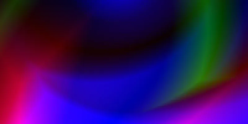
As you have seen in the previous example, the conic effect is rotated around a center which is in the middle of the HTML element. However, you can change such a behaviour and place the center in any desired position.
At the beginning of this article, we've already described all possible options of the conic-gradient() function. For example, in the demo below, the center of the conic is placed at the left side and is aligned in the middle vertically.
.square {
    background: conic-gradient(at 0% 50%, #f0f000 10%, #f03030 30%, #30f030 50%, #3030f0);
}
You may review the given code in the following preview window:
Repeating gradients
Each CSS gradient can be repeated, it means that the provided color stops will be applied to the specific CSS property in a cycle. This is a very convenient feature, for example, you can create a background for a specific element with infinite patterns.
There are repeated CSS functions for each type of gradient, and they are reviewed in detail below.
Example of repeating linear gradient
To make an infinite linear gradient, you have to call the repeating-linear-gradient() function. The generated data will cover the provided container according to the specified list of options and color stops.
The syntax is given below:
background: repeating-linear-gradient(angle to side-or-corner, color1, color2, color2, ...);To show how this feature works, we've created a very simple demo that uses the above function:
.square {
    background: repeating-linear-gradient(to right, #6633cc 25%, #ff3333 50%);
}
Following is the visual preview of our code sample:
Example of repeating radial gradient
You can also make a repeated radial gradient the same way as it's done for the linear gradient. There is also a special function that allows you to make a cycled radial image for the CSS background or any other property.
You can review the syntax below:
background: repeating-radial-gradient(shape size at position, color1, color2, color2, ...);CSS code that implements the above function is shown below:
.square {
    background: repeating-radial-gradient(#f0f033 20%, #f03333 40%);
}
See how the given code sample may look in the browser:
Example of repeating conic gradient
The repeated conic gradient feature uses the same rules that were described in previous sections of this article. There is a special version of the CSS function that can make a repeated conic image.
Please see the syntax:
background: repeating-conic-gradient(from angle at position, color1, color2, color2, ...);As usually, here is a simple CSS code that demonstrates how to use this function:
.square {
    background: repeating-conic-gradient(#33f033 0%, #3333f0 5%);
}
Now, please see preview of the given sample:
Browser support and prefixes
If you are making a gradient for modern browsers, you should not worry about browser compatibility at all. However, if you are building a website for legacy browsers, then the following example may be helpful.
background-color: #3366cc;
background-image: -webkit-linear-gradient(0deg, #3366cc 0%, #cc3366 100%);
background-image: -moz-linear-gradient(0deg, #3366cc 0%, #cc3366 100%);
background-image: linear-gradient(90deg, #3366cc 0%, #cc3366 100%);
In order to make a gradient that works in previous versions of the browsers, you have to use the CSS functions with the "-webkit-" and "-moz-" prefixes. Please pay attention that the old functions have a different starting point of the gradient and you would need to use a different angle if the goal is to have exactly the same effect for different browsers.
Conclusion
As you see, there are many CSS functions related to the gradient functionality and it may take some time to study them. They are complex and require many different parameters, such as shape, position, color stops, etc. But once you understand how all of it works, you can easily create various beautiful visual effects.
Also, it is worth mentioning that the CSS gradient functionality is a very popular feature in web development. Many front-end web engineers use this method in their projects. As a result, knowing how the gradients are rendered by the browser is a very important skill.


Comments